Have you tried all-new PlanMill UI? It ‘s so much easier to use than old UI. We have added many useful features for our new UI and enhanced its overall usability. And what’s better, it’s scalable and responsive, so you can use it from desktop to phones.
What’s new?
- Main navigation has transformed from horizontal to vertical and is situated on the left
- By toggling the menu icon you can hide and show the Main navigation
- Modules are regrouped into a more logical order to enable easier navigation
- Navigation panel allows navigation through quick links is situated on the right side
- Notifications alerts absences, request, tasks and invoices and other relevant notices
- Responsive, possibility to use on smartphones and tablets
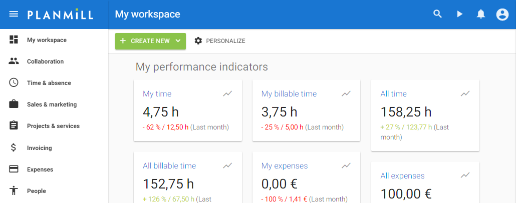
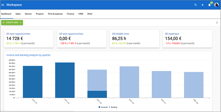
- Possible to see the main structure of the summary page at a glance
- My workspace has a new card based look, which can be personalized with a theme
- New feature for indicator cards is the possibility to toggle between the key value and the corresponding chart
- New location for filters (data tables list view)
- Possibility to add comments to requests’
It is easy – change the view from Classic to New
It looks different than Classic, but it is easier to use and you get the big picture at a glance. Try the all-new PlanMill UI by navigating to My page and changing the User Interface from Classic to New. Old Classic UI will be replaced by all-new New UI by end of 2017. Be ready.
More information is available in our Help.

